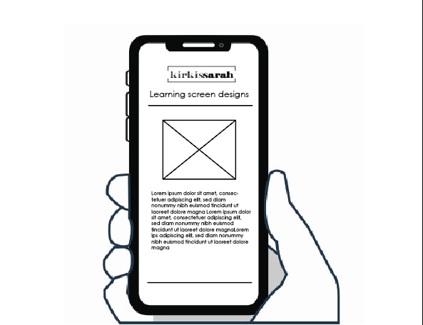
In this week’s lecture pod, we looked into a brief introduction into screen design basics and design patterns for screens. All device with a screen consists of a different design paradigm and pattern language. The common screens include mobiles, tablets, laptops and desktops. As mentioned in the Lecture Pod; patterns are just simple patterns; as it really depends on if there’s an initial issue or problem in the design as some patterns will not work. This can lead into designing your own patterns to better the situation.
A definition of Pattern language is that patterns are reusable solutions often seen in interface and software design. Pattern types that are commonly used in interactive designs include:
The Hamburger Menu – This is a menu symbol consisting of three horizontal lines placed on top of each other. It’s a commonly used option for access to a main menu as it saves space on screen and is recognised all over the web.
Account Registration – A form section for application/registration that is presented in small steps to make process quick, appealing and user friendly
Long Scroll – This feature is commonly used on mobile devices and is great for storytelling sites. The long scroll feature can mimic a multi page layout with clean breaks.
Card Layout – The card layout is great for skimming information quickly as the information is presented in bite sized chunks. The information in these chunks usually include a title, username, text, icons and images.
Hero Images – Main, large images that are above the scroll that grab the user’s attention quickly.
Animation – This interactive tool is very versatile to add a flare of personality, entertainment or a story element. There are a list different types of animations including hover animations, gallery animations and motion animations.
After reviewing the lecture pod, I realised that there are many design patterns that could potentially benefit my designs but not all will overall suit them. When using pattern type and language, they should always serve a user friendly purpose in my design and not just because they look nice.
